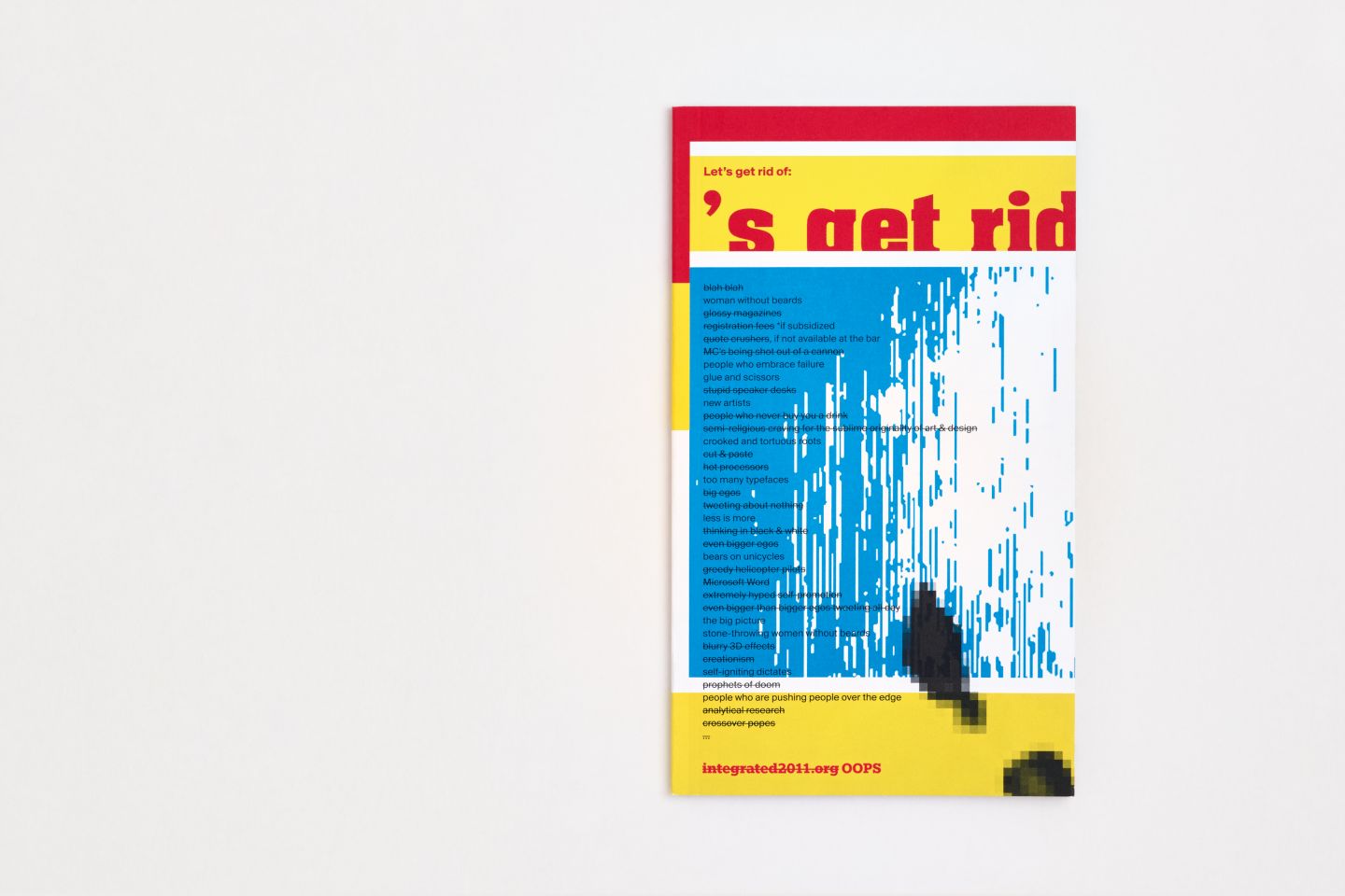
Info
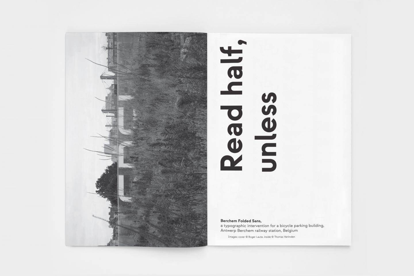
Following a design competition organized by the NMBS Holding (The National Company of Belgian Railways), assisted by Design Flanders (now known as Flanders DC) and the Middelheim Museum Antwerp, graphic design studio visionandfactory was selected to design an architectural intervention for a new bicycle parking facility in Antwerp.
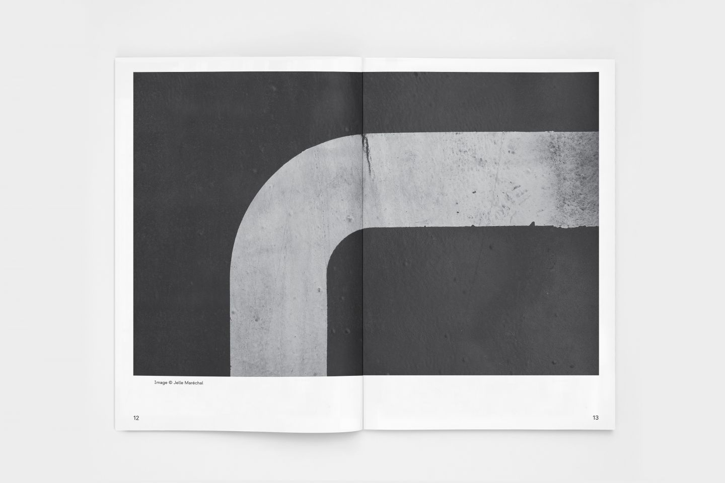
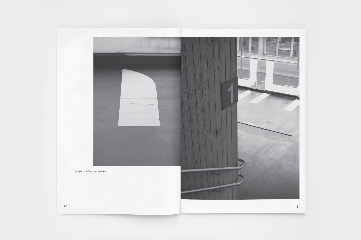
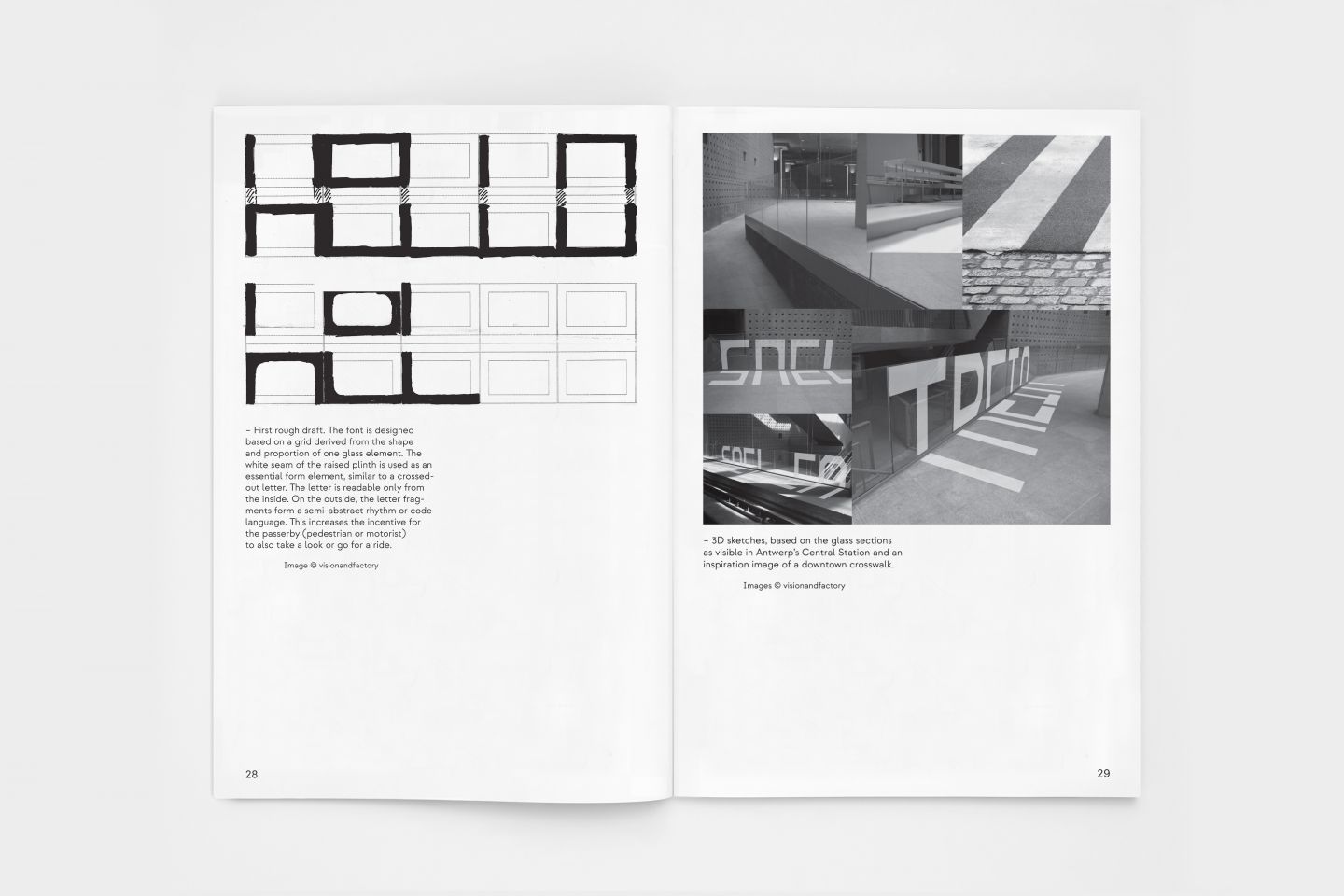
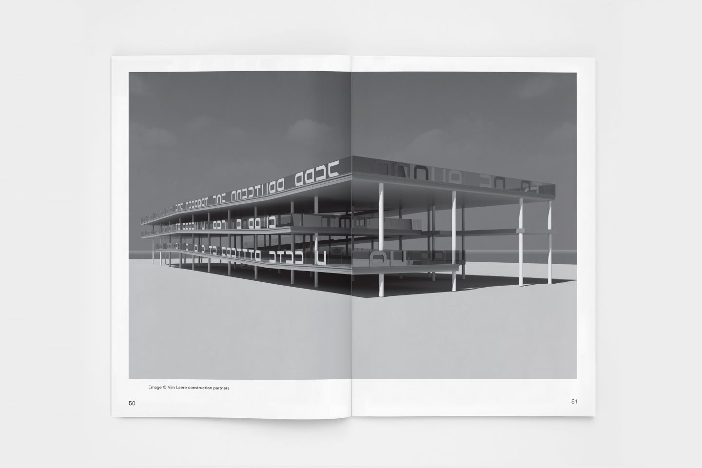
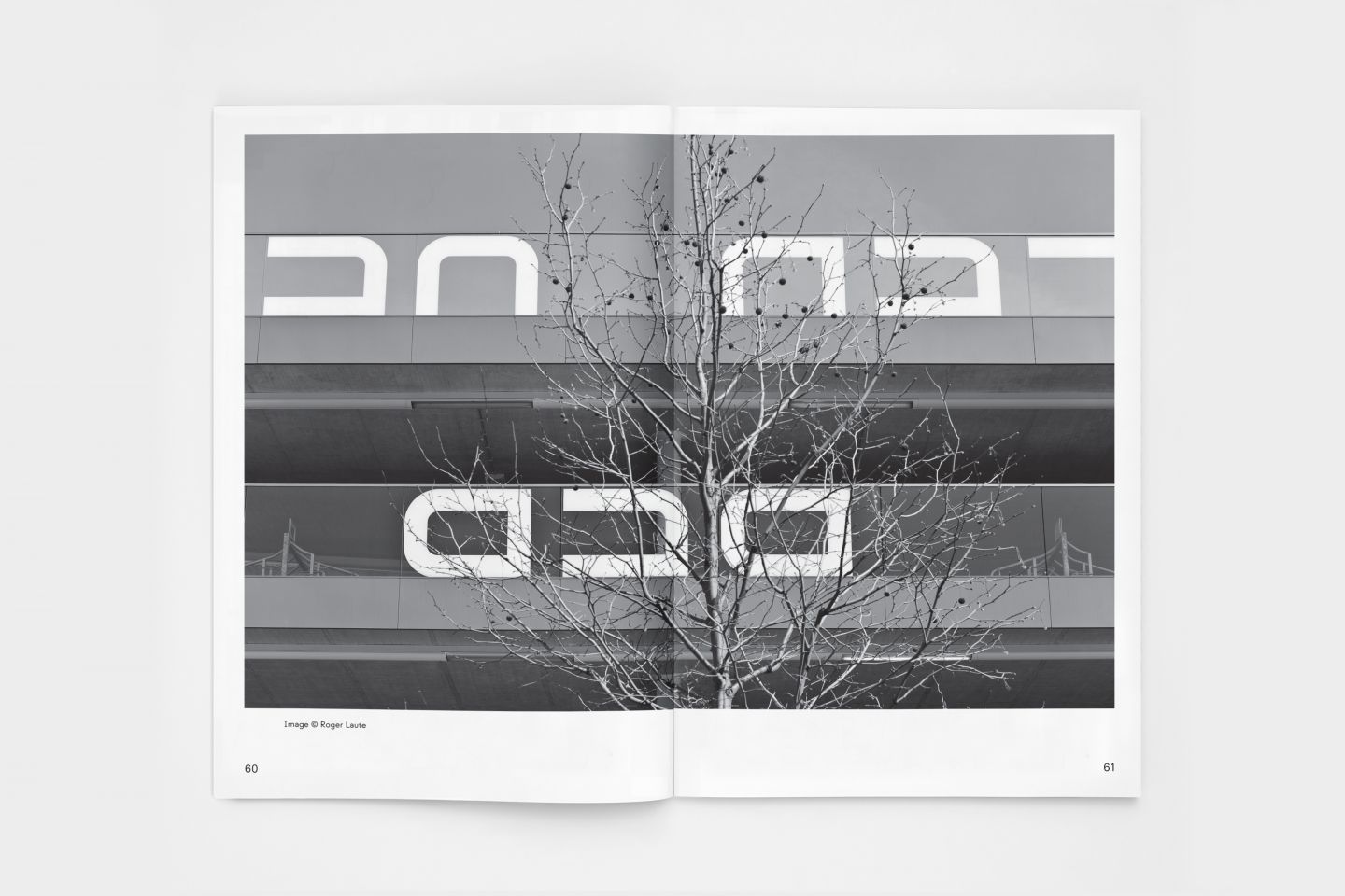
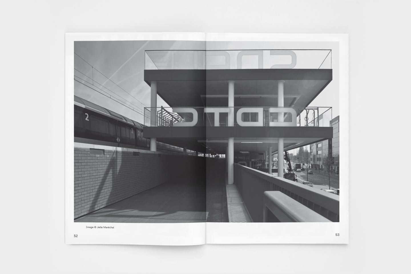
The studio designed an alienating typographic concept based on the power of language, with a lyrical wordplay where letters are half visible on the outside and fully visible on the inside (partly on the glass, partly on the floor) of the building. The interaction with the user of the building is intense; that with the viewer is more of an aesthetic nature. Cycling through the building, the user gradually discovers a lyrical play with words. These words seem to be randomly chosen and placed, but they are not. On a full tour, the text fragments seem to form a whole. Not in the sense of pure poetry, but rather as a linguistic quip referring to the musings of the cyclist during the daily ride to or from the train station. Each word functions as a beacon or place marker so that the bicycle can always be found.
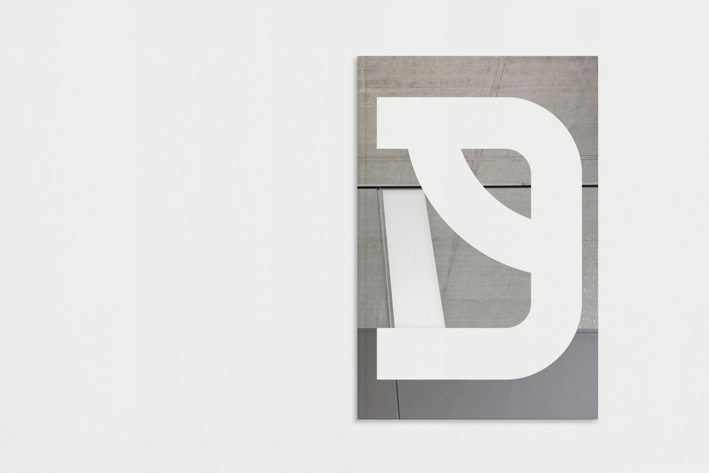
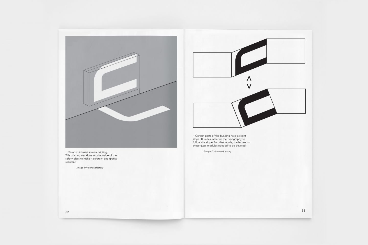
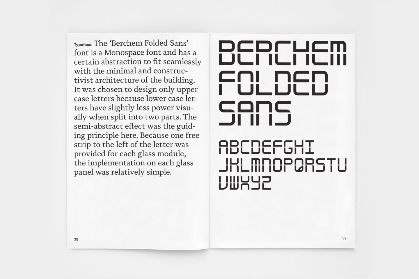
The ‘Berchem Folded Sans’ font designed for this purpose is a Monospace font in which each letter has exactly the same width, so that it fits seamlessly with the fixed format of the glass railings. This publication shows the entire process of this project.
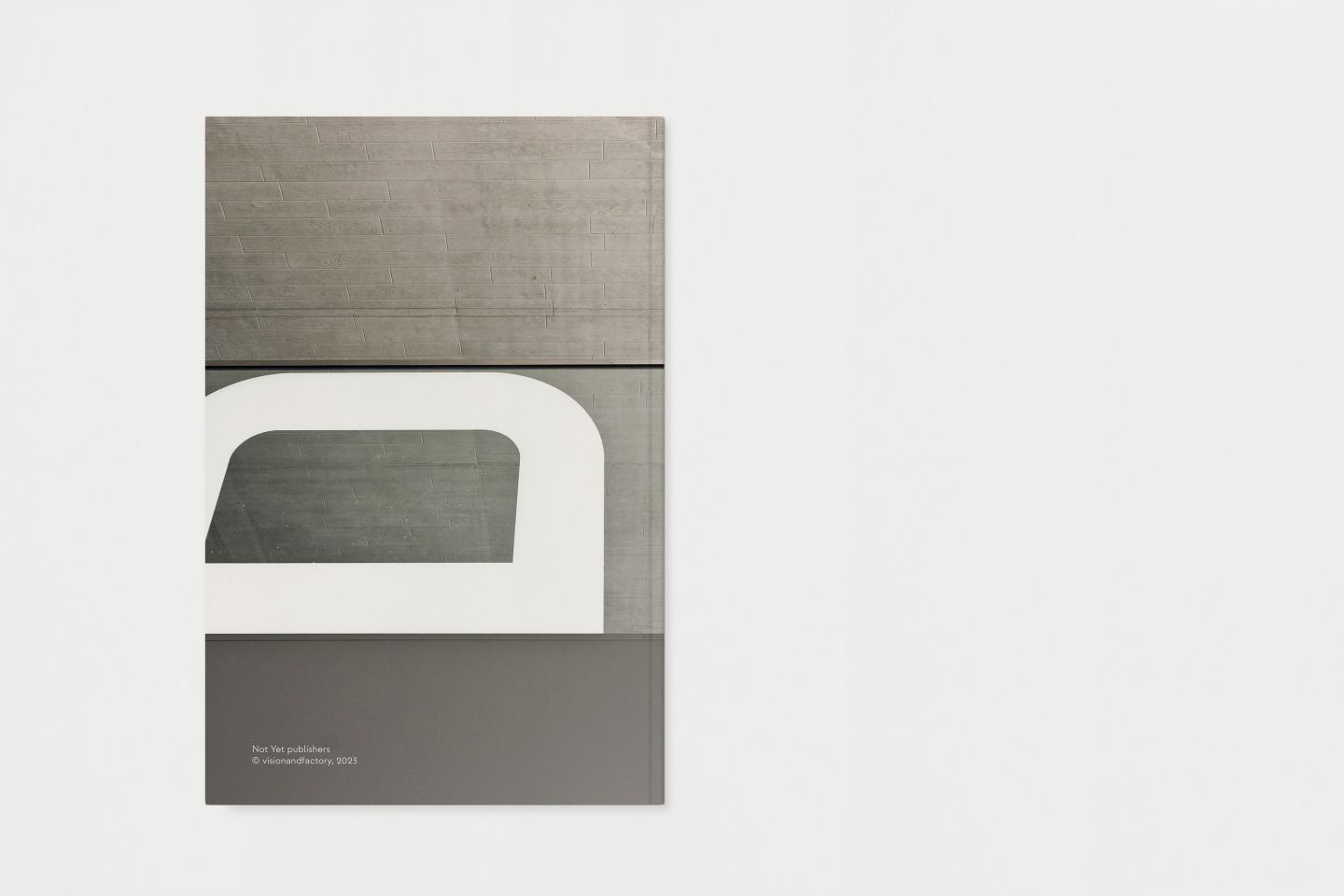
Client: NMBS Stations, architect: Thomas Lootvoet. Design by © Hugo Puttaert (visionandfactory). Photography: by different photographers. Typefaces: Novela & Strawford (Atipo foundry). Paper: Munken Polar 240g (cover) & 120g (interior pages). Digital printing & binding: Belprinto. © Not Yet. Publishers and visionandfactory, 2023
Order the book here