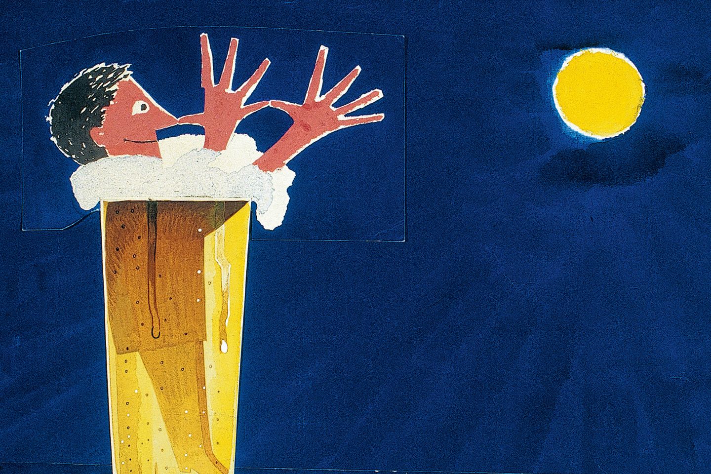
Le paysage est magnifique!
You know that wonderful, nostalgic feeling evoked by a fleeting memory? I vaguely remember a vacation somewhere in the southwest of France. A couple of friends and I had rented a rickety little house and every evening, like clockwork, a hot debate would break out about the mythical concepts ‘esthetics’ and ‘taste’. People will often agree to disagree, but when the topic is ‘esthetics’ and ‘taste’ the gloves come off. I don’t mean to imply that contemporary design is purely esthetic and tasteful, but that the discourse – to the extent that there is one – is too often reduced to a flimsy and, in my opinion, irrelevant discussion about ‘beauty’. The vacation ended on a low note, and we gloomily made our way back home...
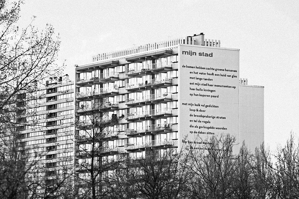
Fortunately we’ve all matured somewhat, and gentle nuances have settled comfortably in our thinking. Beauty and ugliness are, fortunately, not that easy to define. What a relief! The so-called mean streets with their randomness and urban chaos can also be inspirational, for example. In the sixties, the Arte Povera movement challenged us to think about the meaning of things by using materials that were as ‘poor’ as possible. Applied to the same street, it might be a scribble, a tag, a weathered wall, a leftover piece of advertising or an accidental installation which, not recognized as such, is waiting for the garbage truck. These are random cries for attention which might just as well charm or inspire us. In Flanders we understand this.
Improper hierarchy.
When I started my design studio visionandfactory about twenty years ago, I initially had to justify myself to a number of art collectors who had bought my artistic works. It’s true, at the time I worked as a so-called ‘artist’. You have probably figured out the relevance of my introduction by now. But why were these art connoisseurs so critical about my switch? Is styling or design really inferior to free or autonomous art? It’s funny: although crossover has been more or less accepted as a concept, this improper hierarchy still exists. A few years later I decided to add the description integrated design to the name of my design studio, not as a personal statement but as a reference to the attitude which we, today’s graphic designers, embrace. Without arrogance, but also without shame. Simple and to the point, a sort of new unambiguousness.
And speaking of unambiguousness: ‘design’ is a bizarre concept. A few years ago I put it as follows in De Standaard: “Design has become a knee-jerk concept, too often disconnected from its own content. More often than not it’s a hip lubricant used to sell all kinds of stuff. To the extent that design evokes an image of some minimalist piece of furniture for most people, the meaning of the concept does not refer to the product. It refers to the action. If you’ve looked it up in an English dictionary, you know that ‘design’ refers to the process of conceiving something, to planning something based on detailed preliminary studies or drawings. Giving form to concepts, in other words. This play on words may seem trivial, but it’s not. For example: a Dutch colleague was accosted in a so-called design shop by an overly enthusiastic salesman who claimed that a particular beautiful doorknob was designed by a real ‘design designer’.” Could it possibly get any more absurd? …
Read more by downloading the pdf.
Info
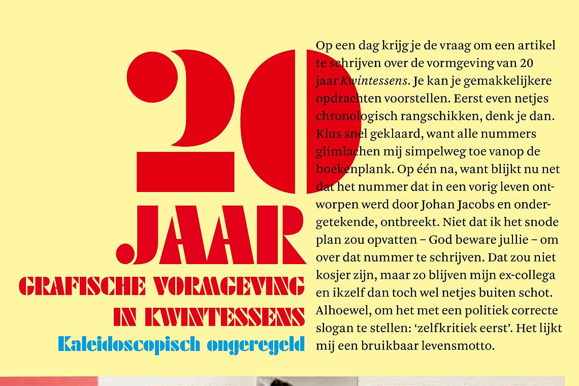
Critical essay commissioned by Design Flanders & published in Kwintessens issue 2009-4. Language: English & Dutch.
download pdf
