Kaleidoscopically irregular.
One day, you’re asked to write an article on 20 years of Kwintessens. You could probably think of easier tasks. Well then, start by putting everything in chronological order, you think. Mission quickly accomplished because every issue is just sitting there smiling back at you from the bookshelf. Except for one, that is, seeing that it now appears that it is precisely that issue that was designed in a previous life by Johan Jacobs and yours truly that is missing. Not that - God forbid - I would pursue that wicked plan to write about that issue. That wouldn’t be kosher, and that’s how my former colleague and I keep well out of range. Although, to put it in terms of a political slogan: "self-criticism above all else". It seems a useful life motto.
So far, so good. So, let’s start by putting everything neatly in order, from one volume to the next, in numerical order. This chronological arrangement is not really to be recommended, knowing that each and every issue is fundamentally different, and also not very practical because all the useful information, such as volume and number, always and almost by definition, pops up in a different place. And, what’s more, the volumes are in Roman numerals, which is also not one of my strong points. I rotate, turn, page through from front to back and back again, until a certain despondency settles inside me. But what the heck; nobody really cares about the chronological order. It is, after all, also impossible to compare every issue with one another. Kwintessens was initially just an stapled magazine with a limited number of pages, usually 48. These days, it’s a sturdy publication, sometimes consisting of 120 pages, neatly finished off with a hard spine and always with varying paper quality, sophisticated finishing and refinement techniques. Let me especially not be misled by the latter, I suddenly think.
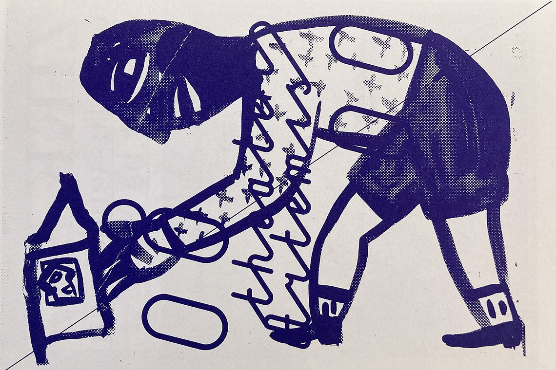
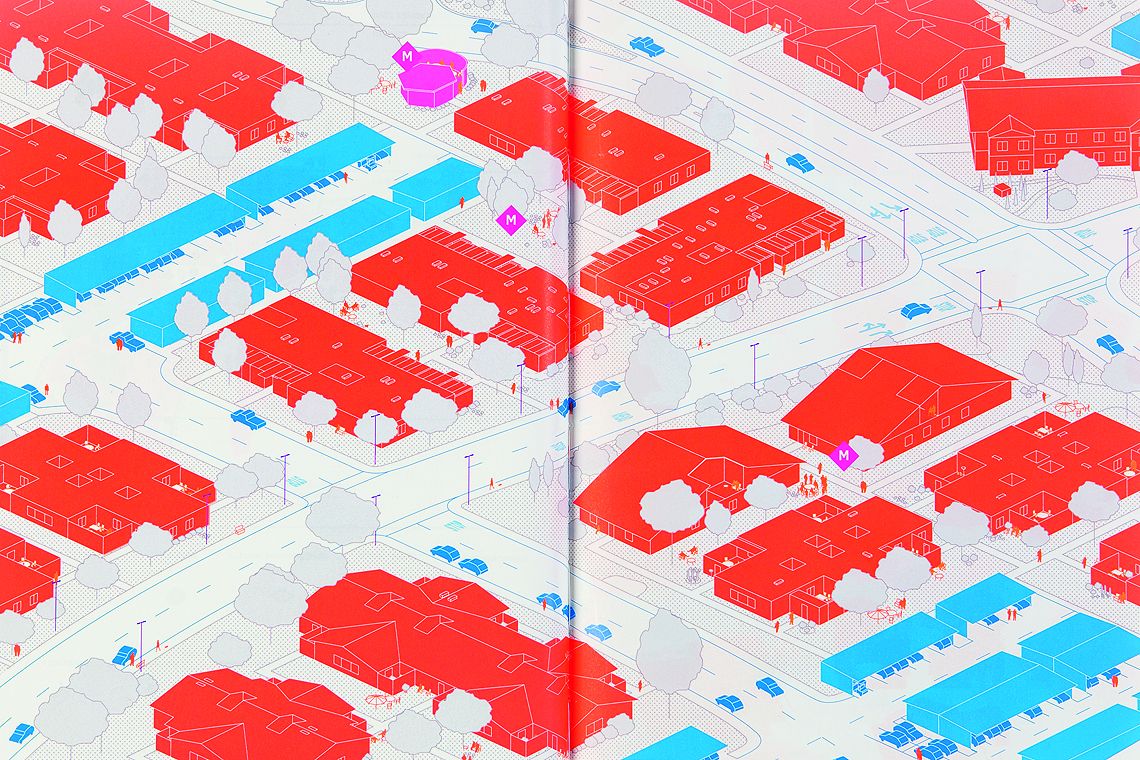
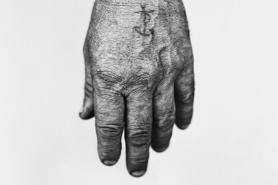
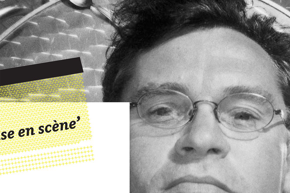
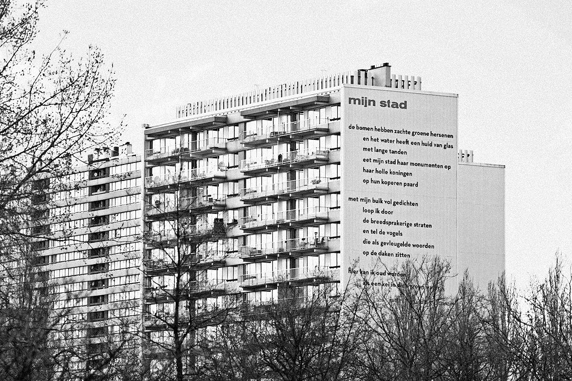
This exploration – actually more of an odyssey – can only be completed after thorough inspection. Because you discover no more or less than a kaleidoscopic image of a graphic Flanders from the last two decades. I immediately remember that – when the new Kwintessens arrived in the post – I played a sort of game with myself to guess who the featured graphic designer was. Because you must know the following: right from the start, the editorial team decided to entrust the layout of each issue to a different graphic designer. This was a clever move and also a rather courageous one because how do you develop the image of a magazine that is constantly changing? …
Read more by downloading the pdf.
Info
A critical essay about the increasing international influence of Belgian graphic design. Published in Kwintessens issue 4/2011 by Design Flanders. Language: Dutch & English.
download pdf